Tuesday, October 26, 2010

How To Mix & Match Graphics in RocketLife

Each theme in RocketLife includes a related set of Placeable Graphics. The Halloween theme, for example, offers nine: a bat, a ghost, two moons, two spiderwebs, a black cat, some pumpkins, and a spider. However, we don't restrict you to one set; you can easily grab and use any graphic in the program. (There are currently more than 800.)

In case you missed our last tutorial, Placeable Graphics are like stickers without the goo: You can drop these images on your layout and smoothly rotate, resize, and even tint or crop them.

This calendar page features two placeable graphics — a moon and a spider. (The bats are part of the Halloween theme itself.)
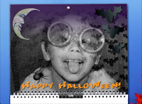

This calendar page mixes Placeable Graphics from two themes. Also notice how RocketLife automatically blended the main photo into the theme for an extra spooky effect. (Click to enlarge.)

The spider image came from the Halloween theme:
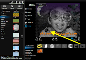

To add the spider graphic to our layout, we clicked the Design tab, then the Placeable Graphics tab, and then the spider image. (Click to enlarge.)

The moon image came, surprisingly, from the Garden Surprise theme:
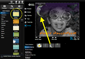

Selecting a new theme from the lefthand column in Design mode brings up its set of Placeable Graphics. We found the perfect moon in the Garden Surprise theme. (Click to enlarge.)

Tip To add even more spooky atmosphere, we then selected the moon on the layout and made it slightly transparent, simulating fog. You'll find transparency controls in the Touch-Up tab.

Placeable graphics are especially good for scrapbooking, as RocketLife expert Kim Guymon demonstrates in this video, Digital Scrapbooking with RocketLife. And you can even add your own.

Friday, October 8, 2010

Digital Scrapbooking with RocketLife

RocketLife's layout tools are remarkably flexible. In this video, Kim Guymon of ScrapBiz and PhotoBooks{etc} shows how to use the program (version 1.0!) for scrapbooking.

Starting with a plain white theme, she loads a custom background image, a couple of photos, and some partially transparent PNG graphics. (For more on using PNGs to make your own placeable graphic "stickers," see Cool Tip: Adding Your Own Graphics and Logos in RocketLife.)

Using RocketLife's cropping, resizing, layering, and text tools, Kim quickly creates a cheerful scrapbook page with a unique personality.

Tuesday, September 14, 2010

How To Make a Photo Book in 3 Minutes with RocketLife

RocketLife Creative Director Gina Barbosa shows how to create and customize your own photo book with RocketLife software. From start to finish, it actually takes less than three minutes. Of course, once you go back and start customizing, you can happily spend hours!


What topics would you like to see us cover next? Please leave a comment.

Thursday, July 1, 2010

Cool Tip: Dare To Theme

The RocketLife software offers more than 1,600 graphic themes to enhance your photo layouts. That may sound like too much of a good thing, but we've organized the themes into three nested categories, so trying new looks is easy.

At the top level are categories such as Sports and Pets. These contain subcategories such as Tennis and Cats. And finally, each subcategory contains a set of variations, complete with designer-selected colors and placeable graphics.


Can you guess which theme we used here? It's not the obvious choice. (Click to enlarge.)

To get started exploring themes, click the Themes tab, select a category, and then click a thumbnail image in the Apply Theme column:


The Themes tab shows the top-level categories (A). Click a thumbnail image (B) to apply one of the themes to your layout. Click the Designs button (C) to step through variations. (Click to enlarge.)

Tip: Clicking the Design tab lets you see all theme variations at once:


Each theme offers numerous variations, shown in the thumbnail images at the bottom of the page. The variations with the head-and-shoulders silhouette automatically blend the biggest photo into the background. (Click to enlarge.)

Here's the cool tip: Don't feel restricted by the theme category names. You can get some really interesting results by thinking outside the box. For the Japanese water park photos above, we initially tried themes such as Swimming and Water Polo, but ended up liking the contrasting colors in the Fencing theme more.

There was just one snag: The left edge of this particular theme variation had a silhouette of a swordsman. So we covered it with a placeable graphic and used the photo tint feature in the Touch-Up tab to match one of the background colors:


Partially covering the sword-fighter silhouette with a placeable graphic transformed it into a background texture.

Here's the final layout again:


With some creative masking, the Fencing theme worked well for this water park layout. (Click to enlarge.)

For more creative ideas for placeable graphics, see these Cool Tips:

Friday, June 18, 2010

Cool Tip: The Daddy of All Photo Frames

Kate in RocketLife Support shared this clever collage she made for Father's Day. (Click the image to zoom in.) Notice there are just six components:
  • The background photo
  • The text, "Happy First Father's Day 2010"
  • Three small baby photos
  • The large "dad" placeable graphic from the Father's Day theme


Notice how the "dad" graphic neatly frames the baby pictures. (Click to enlarge.)

There are two ways to convert a photo to a background image in RocketLife. To start, select the photo and then click the Tools menu. (That's the button at the top left corner of the photo.) Next, choose either Copy to Background or Make Photo Full Page. The Copy command blends the photo into the texture of the theme. The Full Page command enlarges the photo to fill the page. In this case, we want to use Full Page:


Instantly enlarge a photo to fill the page by clicking the Make Photo Full Page command in the Tools menu. (Click to enlarge.)

Tip Notice how Kate's background photo is faded slightly to emphasize the text and foreground images. To get a similar effect, choose the Plain White theme (in the Basics category), select the Touch-Up tab, and then set Transparency to about 30. That will let part of the white background show through, fading the image.


The Transparency effect makes images fade into the background, helping to emphasize other elements on the page.

As you can see, the Touch-Up tools aren't just for fixing problem photos. You can also use them creatively. We'll explore that idea further in future tutorials. To read more tips for using placeable graphics, see Adding Your Own Graphics and Logos in RocketLife.

What clever techniques have you discovered, Daddy-O? Please leave a comment!

Wednesday, June 2, 2010

Cool Tip: Adding Your Own Graphics and Logos in RocketLife

RocketLife photo software comes with more than 800 placeable graphics — images you can add to your layout to add depth and interest. We create these images with transparent backgrounds to help them blend into the composition. Notice the sunflower below, inserted from the collection of placeable graphics at the bottom of the screen. Thanks to the transparent background, you can see between the petals. (Click image to enlarge.)


Adding a placeable graphic in RocketLife. Notice how the flower also includes a drop shadow to add depth.

TipEach theme in RocketLife has its own set of placeable graphics. Here's how to browse them quickly:
  1. Click the Design tab.
  2. Click the Placeable Graphics tab (below the Design tab).
  3. Click a theme button. The grid of graphics at the bottom of the screen will update:

Browse placeable graphics by clicking the Design tab (1), and then the Placeable Graphics tab (2), followed by a theme button (3). Click a graphic in the grid to add it to your layout. (Click photo to enlarge.)

Read on to learn how to add your own graphics to a RocketLife project.

Thursday, May 27, 2010

Cool Tip: The Whole Calendar Is Your Canvas

RocketLife software was designed to reward experimentation, and its drag-and-drop support is a great example of that. Try dragging objects around the screen to see what happens: You can create some unexpected designs.

Here's one of our favorite tips: You can customize the grid area of the calendar project as well as the top section. This is a great way to personalize a month. Simply drag a photo of each person in your family onto his or her birthday square, or add a placeable graphic such as a flower or balloon.

In this example, we dragged two graphics, a photo, and a text box onto the calendar grid. We then used the Transparency button to make the elephant graphic blend into the background. (Click the image to see the details.)

You can customize the grid section of the calendar as well as the main photo. (Click to enlarge.)

We'll be sharing many more fun secrets like this in upcoming posts. What techniques have you discovered? Please leave a comment below, or tell the world over on our friendly Facebook page.

Wednesday, April 28, 2010

Introducing RocketLife

Welcome to the official RocketLife blog! Here we'll share tips on creating amazing photo projects with the RocketLife software.

Often, a good way to get to know someone is to listen to what others say about them. Fred Thorlin of HAL PC magazine made his own photo book with an early version of RocketLife and saw the difference right away. His review begins:

It looks like there is a breakaway leader in the Internet photo-processing category. If you want prints, just look for the lowest priced provider. If you want a good deal more, try RocketLife. RocketLife provides so much more support in producing your photo product than the other photo sites I have looked at it is no contest.

The first thing Fred noticed was RocketLife's speed:

All image processing is done on your computer; the pictures are not first copied to a web site for processing as is common. Because of this you are instantly editing and you work with your original images at their full original resolution. When you have finished adding photos you will see that your completed Photo Book is already displayed on your screen with your photos tastefully arranged in chronological order! Startling!

Pause for a moment and rejoice. You haven’t had to create a password, establish an account, or provide you mother’s maiden name and you are using RocketLife productively. How civilized!

We especially liked how Fred grasped the playful nature of the RocketLife software. Unlike typical photo-layout software, which plugs your pictures into rigid templates and marches you toward the checkout line, RocketLife encourages experimentation. Fred continues:

You can stop here and order the Photo Book as is, but then you would be missing most of the fun. Switch to the Themes mode to begin. There are so many things to play with, and they all work so easily, that it is hard to proceed in an orderly fashion. RocketLife just makes photo products for you, in a fun way, for a competitive price, conveniently.

Read the rest of the review to see the photo book Fred created. We've added many more features and graphics to RocketLife since then. Look for a download link to the latest version in the next few days.

Questions? Wishes? Ideas? Get creative and leave a comment below!